As a submission for an internship for the Carroll and Milton Petrie Foundation, I did some exploratory analysis for
this dataset containing countless information about colleges in the United States.
The full documentation listed on College Scorecard can be found here. In the original dataframe that was derived from the dataset, there were too many columns to work with.
Skipping over loads of dimensional reduction and cleaning up missing values, I decided on the main columns that I wanted to work with.
| |
region |
institution |
state |
city |
fed_loan_percentage |
pell_grant_percentage |
median_student_debt |
total_students |
ugds_men |
ugds_women |
ugds_white |
ugds_black |
ugds_hisp |
ugds_asian |
ugds_aian |
ugds_nhpi |
ugds_2more |
ugds_nr |
ugds_unkn |
| 4824 |
5 |
Charleston School of Law |
SC |
Charleston |
nan |
nan |
nan |
nan |
nan |
nan |
nan |
nan |
nan |
nan |
nan |
nan |
nan |
nan |
nan |
| 1379 |
2 |
Morgan State University |
MD |
Baltimore |
0.7861 |
0.5582 |
18359 |
6263 |
0.3944 |
0.6056 |
0.0164 |
0.8258 |
0.0442 |
0.0057 |
0.0016 |
0.001 |
0.035 |
0.0398 |
0.0305 |
| 1425 |
1 |
Clark University |
MA |
Worcester |
0.6256 |
0.2316 |
23000 |
2205 |
0.3787 |
0.6213 |
0.6177 |
0.0481 |
0.0971 |
0.0707 |
0.0005 |
0.0005 |
0.0327 |
0.0916 |
0.0413 |
| 2717 |
8 |
Portland State University |
OR |
Portland |
0.3452 |
0.5362 |
16166 |
16596 |
0.44 |
0.56 |
0.5101 |
0.0398 |
0.1864 |
0.0987 |
0.0116 |
0.0066 |
0.0674 |
0.0375 |
0.0421 |
| 5070 |
6 |
The Art Institute of San Antonio |
TX |
San Antonio |
0.5556 |
0.5694 |
19000 |
374 |
0.4492 |
0.5508 |
0.254 |
0.1925 |
0.4545 |
0.0134 |
0.0107 |
0.0027 |
0.008 |
0.0241 |
0.0401 |
Region key:
| |
Region |
| 1 |
New England Division |
| 2 |
Middle Atlantic |
| 3 |
East North Central |
| 4 |
West North Central |
| 5 |
South Atlantic |
| 6 |
West South Central |
| 7 |
Mountain |
| 8 |
Pacific |
| 9 |
Virgin Islands, Puerto Rico, American Samoa |
The first questions that I wanted to answer for this exploratory analysis is _what is the average race distribution for
every student body in each region of the United States?
demographics = [ugds_white, ugds_black, ugds_hisp, ugds_asian, ugds_aian, ugds_nhpi, ugds_nr, ugds_2more]

for demograohic in demographics:
  df_all_race_demo_region_percentage = df.groupby('region')[df[demographics[i]].mean().reset_index()
  df_all_race_demo_region_percentage[demographics[i]] *= 100

 df_all_race_demo_region_percentage
| |
region |
ugds_white |
ugds_black |
ugds_hisp |
ugds_asian |
ugds_aian |
ugds_nhpi |
ugds_nr |
ugds_2more |
| 0 |
1 |
57.603 |
11.6097 |
13.5798 |
4.1663 |
0.388457 |
0.124373 |
3.36936 |
3.49817 |
| 1 |
2 |
53.8537 |
19.2548 |
13.3173 |
4.35984 |
0.284763 |
0.190558 |
2.4026 |
2.78183 |
| 2 |
3 |
59.641 |
19.4984 |
9.67792 |
2.45622 |
0.785451 |
0.175403 |
1.46493 |
3.19042 |
| 3 |
4 |
66.6972 |
10.4764 |
8.03708 |
2.32747 |
3.91095 |
0.198337 |
1.95838 |
3.42687 |
| 4 |
5 |
46.6168 |
31.2633 |
11.474 |
1.78546 |
0.473513 |
0.23736 |
1.72444 |
2.67568 |
| 5 |
6 |
33.6464 |
16.2351 |
34.5133 |
3.00924 |
3.82658 |
0.248525 |
1.19305 |
3.7166 |
| 6 |
7 |
62.4206 |
3.97608 |
15.7429 |
2.92041 |
3.84135 |
0.704865 |
1.1418 |
3.60077 |
| 7 |
8 |
31.7099 |
7.25795 |
33.6544 |
10.5413 |
1.31536 |
1.1694 |
3.10716 |
5.22554 |
| 8 |
9 |
0.181812 |
0.772101 |
92.9425 |
1.05406 |
0.03 |
4.29493 |
0.245145 |
0.0807971 |
To be able to better visualize the student body race distribution in each region. I wanted to make a bar graph of each race
and their presence percentage.
columns = ['ugds_white', 'ugds_black', 'ugds_hisp', 'ugds_asian', 'ugds_aian', 'ugds_nhpi', 'ugds_nr', 'ugds_2more']
plt.figure(figsize = (20, 9))
plt.suptitle('student body race demographics by region')
for i in range(len(columns)):
    plt.subplot(2, len(columns), i + 1)
    g = sns.barplot(data = df_all_race_demo_region_percentage, x = 'region', y = columns[i]).set_title(columns[i])
    plt.ylabel('percentage')
    g.axes.set_ylim(0,100)
    plt.tight_layout()
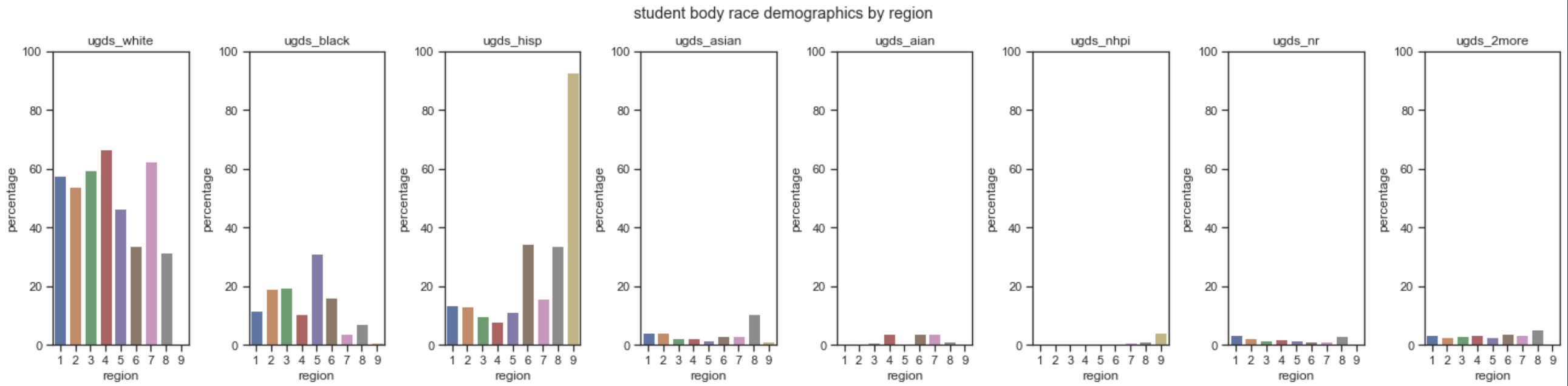
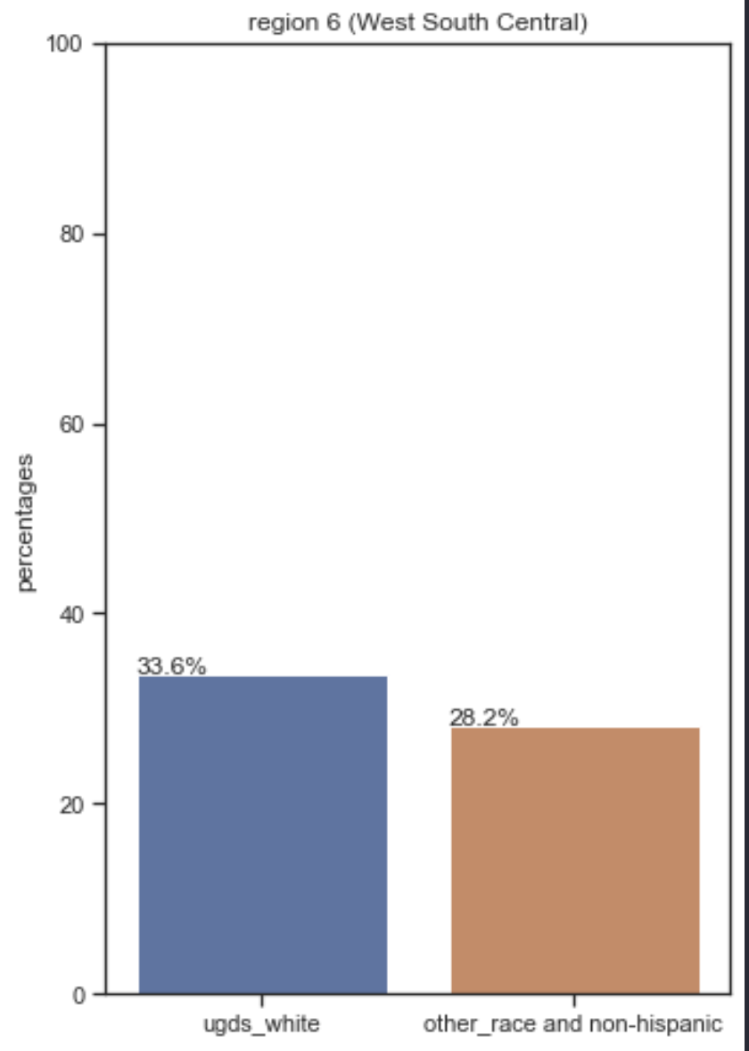
It’s to note that white students most often dominate the student body on average for almost every region of the United States, besides the US Virgin Islands/Puerto Rico/American Samoa region. In the region that contains a relatively less amount of white students on average, West South Central, you can can add up every single race demographic average, discounting Hispanic, and it still wouldn’t end up surpassing the percentage of white students.
This does beg further insight into the dataset. Therefore next up, I will be taking a look at if there is any correlation in financial aid availability and race demographics in each region.
df_financial_aid_by_region = df.groupby('region')['fed_loan_percentage', 'pell_grant_percentage', 'median_student_debt'].mean()
df_financial_aid_by_region.reset_index(inplace = True)

df_merged_finaid_allrace = df_all_race_demo_region_percentage.merge(df_financial_aid_by_region)
sns.heatmap(df_merged_finaid_allrace.corr(), annot = True, cmap = 'Greys')
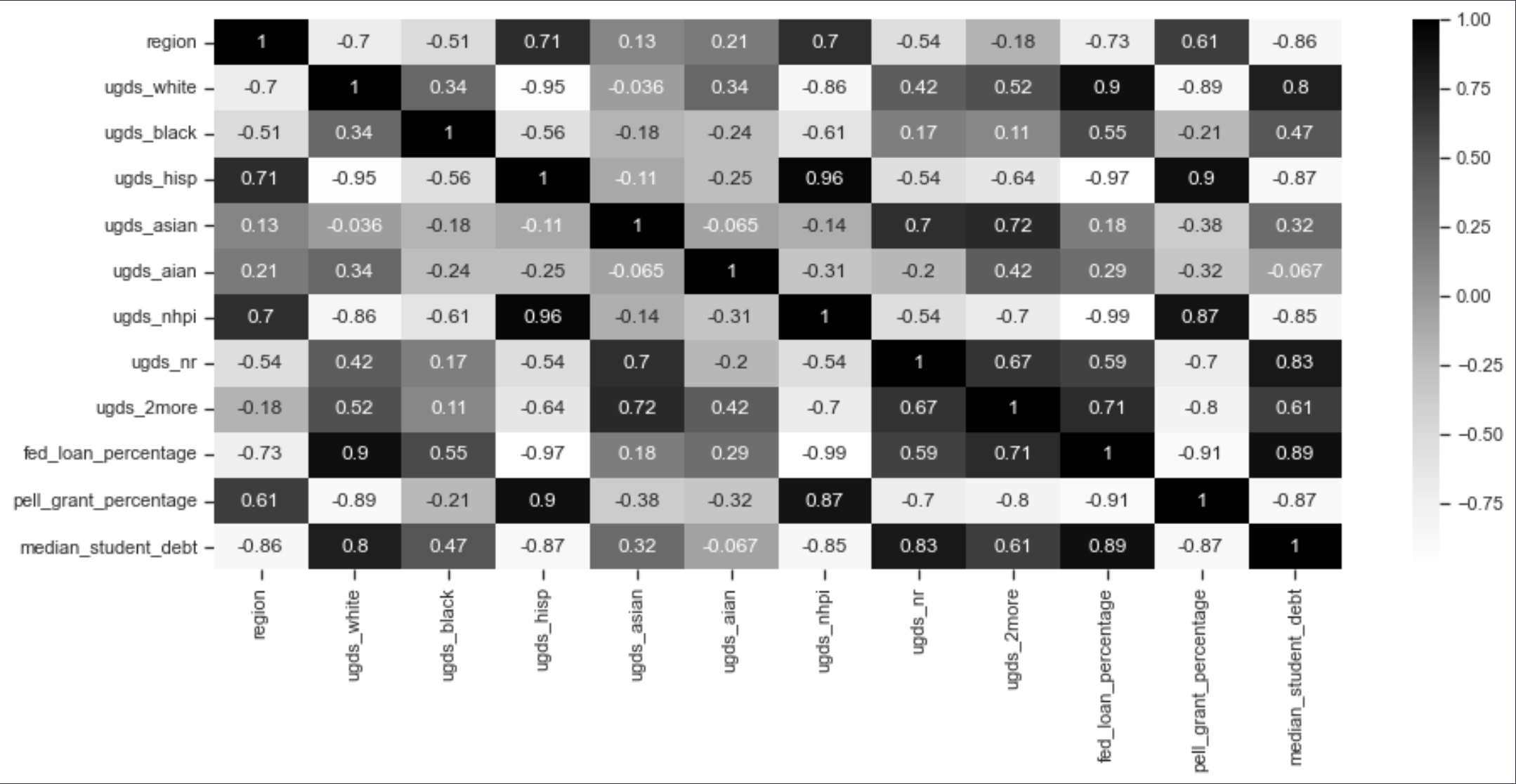
Here are some interesting insights I can make according to the correlation graph:
1) I can see that the share of students that receive federal loans lie largely within white student bodies in the US. Which does make sense with the large correlation that the white student body has with median student debt.
2) Native Hawaiian/Pacific Islanders and Hispanic seem to be the only two main student bodies that benefit from Pell Grants.
3) The non-resident student body is 2nd most in federal loan share percentage which could be attributed to the low percentage of non resident students in total.